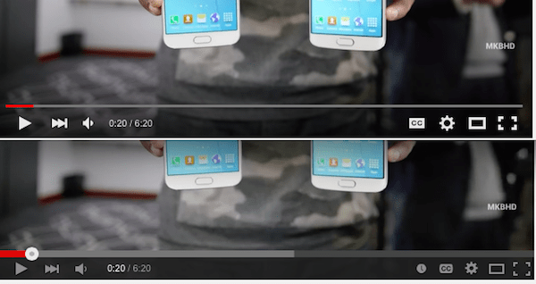
Does YouTube look different to you today? If you’re noticing that the YouTube player on the desktop seems to have a sleeker look-and-feel, then you’ve probably spotted the update YouTube has just rolled out. The company launched a new HTML5 video player for desktop users, which now features a transparent control bar that disappears when you’re not using it, as well as updated buttons and drop-down menus. The revamped player, spotted by the Google Operating System blog, has been in testing for around four months. With the changes and the disappearing controls, the YouTube player on the desktop now operates more like it does on mobile devices. However, as part of the update, the “Watch Later” button has been removed from the control bar. The buttons on the new player are also larger, while the drop-downs for speed and quality also look to be more mobile-inspired, the blog noted at the time of the initial tests.The updates, while minor in the grand scheme of things, come at a time when more people are watching YouTube on their phones than ever before. The company recently noted that, on mobile, YouTube is now seeing average session times of over 40 minutes, which is up more than 50 percent over last year. Meanwhile, growth in “watch time” on YouTube is now up 60 percent year-over-year – which is the fastest growth rate it has seen in two years. It makes sense then that YouTube would want to streamline its products to make its desktop web player feel more like its mobile counterpart, especially as users switch back and forth between devices. This is not the first time that YouTube has updated its product due to the impact of mobile users and their behaviors, we should point out. Recently, for example, the company made a change to how it displays vertical videos – which is a popular format now because of how users today hold their phones when they hit “record.” With an update to its iOS and Android apps, YouTube now expands these videos to fill your phone or tablet’s display.
Tuesday, 4 August 2015
YouTube’s Desktop Web Player Gets A New Look
Does YouTube look different to you today? If you’re noticing that the YouTube player on the desktop seems to have a sleeker look-and-feel, then you’ve probably spotted the update YouTube has just rolled out. The company launched a new HTML5 video player for desktop users, which now features a transparent control bar that disappears when you’re not using it, as well as updated buttons and drop-down menus. The revamped player, spotted by the Google Operating System blog, has been in testing for around four months. With the changes and the disappearing controls, the YouTube player on the desktop now operates more like it does on mobile devices. However, as part of the update, the “Watch Later” button has been removed from the control bar. The buttons on the new player are also larger, while the drop-downs for speed and quality also look to be more mobile-inspired, the blog noted at the time of the initial tests.The updates, while minor in the grand scheme of things, come at a time when more people are watching YouTube on their phones than ever before. The company recently noted that, on mobile, YouTube is now seeing average session times of over 40 minutes, which is up more than 50 percent over last year. Meanwhile, growth in “watch time” on YouTube is now up 60 percent year-over-year – which is the fastest growth rate it has seen in two years. It makes sense then that YouTube would want to streamline its products to make its desktop web player feel more like its mobile counterpart, especially as users switch back and forth between devices. This is not the first time that YouTube has updated its product due to the impact of mobile users and their behaviors, we should point out. Recently, for example, the company made a change to how it displays vertical videos – which is a popular format now because of how users today hold their phones when they hit “record.” With an update to its iOS and Android apps, YouTube now expands these videos to fill your phone or tablet’s display.
Subscribe to:
Post Comments (Atom)
No comments:
Post a Comment